Case Studies
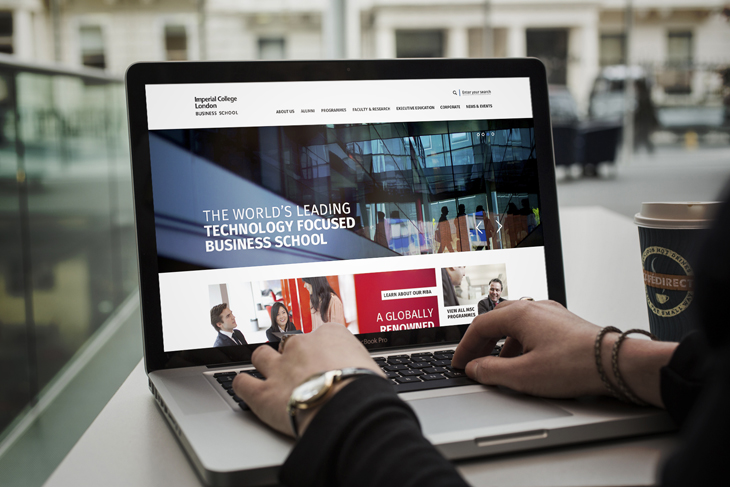
Our new website for Imperial College Business School
 For Imperial College Business School, a university furthers the “expansion of the boundaries of knowledge.” The School’s existing website entirely obscured this ideal. Outdated, extremely hard to navigate and lacking any distinction from Imperial College, the website needed a bespoke direction to achieve its high expectations.
Consistently ranked as one of the world’s best universities, Imperial College London offers world class teaching and research. While this is a highly valuable association, the Business School wanted to be recognised as an institution in its own right, rather than simply a part of Imperial College. To be positioned as a global brand, the organisation required a distinct identity.
Imperial College offers world class teaching and research
A dual navigation system formed part of the problem. With over 1500 pages, the existing website was both hard to navigate and contained duplicated content.
As content for both the Business School and Imperial College featured the same pages – such as staff profiles – there was an unnecessary overlap between the two. Our solution was to introduce a link that takes you back to the original Imperial site, essentially separating the Business School from the master brand.
 To be positioned as a global brand, the site needed to appear current. While the Business School prides itself on its research being sought by and partnered with governments, policy-makers and global business leaders, the existing site was both outdated and unapproachable. The site was outdated and inaccessible
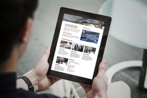
Our solution was to make the site highly responsive; it now includes a suite of interactive elements, featuring accordion tabs, sliders, pull-out quotes and galleries. Regardless of where they sit in the site’s navigation, the key pages are now exciting and interactive.
Another reason why the School’s existing site appeared restrictive, inaccessible and outdated was because it struggled to maintain and generate content. Our solution for this was to switch from Oracle CMS to WordPress. Easy to maintain, WordPress allows the School to author content more effectively, thus creating a more current experience.
We switched from Oracle CMS to WordPress
We also increased accessibility through making the accessibility policy meet W3C standards for visually impaired users. Introducing breadcrumbs allows users to keep track of their locations effectively, increasing both navigability and accessibility.
Additionally, changing system fonts to web fonts that are in line with Imperial College’s corporate guidelines allowed the site to be more consistent with corporate comms. This change also made the site more unique and memorable.
 We launched the site to work alongside a series of comms for the Business School. The overall look and feel of both the comms and the website is now clean, bright and engaging, reflecting the institution’s dynamic and open ethos. We continue to work with Imperial College Business School on upcoming global MBA products and other site features.
We’ve been working with Imperial College Business School for a number of years now. If you’re interested, check out the Hub HTML 5 app we developed and our redesign of the Business School area within Imperial College’s Blackboard e-learning system.


