Case Studies
Structural brand identity created for Netnames
Firedog has created a modular hexagonal design system to support the brand of a leading web technology and digital branding business.
NetNames is a leading provider of global brand protection and internet domain name management services. Our brief was to take a tepid campaign identity and wrap it within a cohesive yet flexible visual identity system which could be applied across all channels and communications.
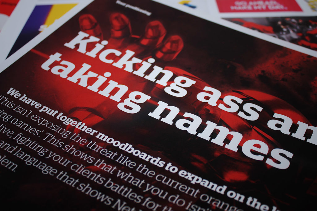
Whilst the existing digital branding used the colour orange consistently, the supporting visual assets lacked consistency and brand clarity. Our remit was to create a design system which brought the Netnames universe together in order to increase brand recall and power.
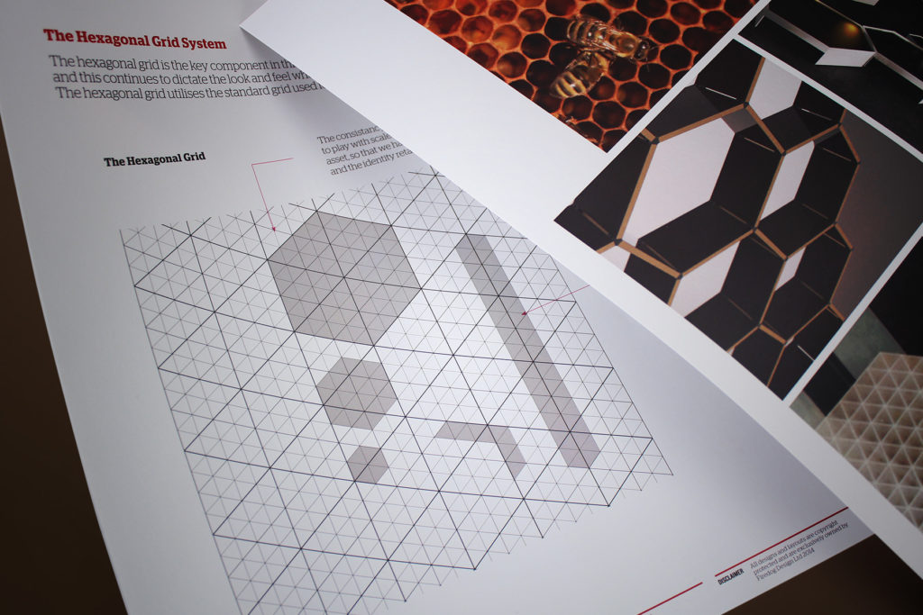
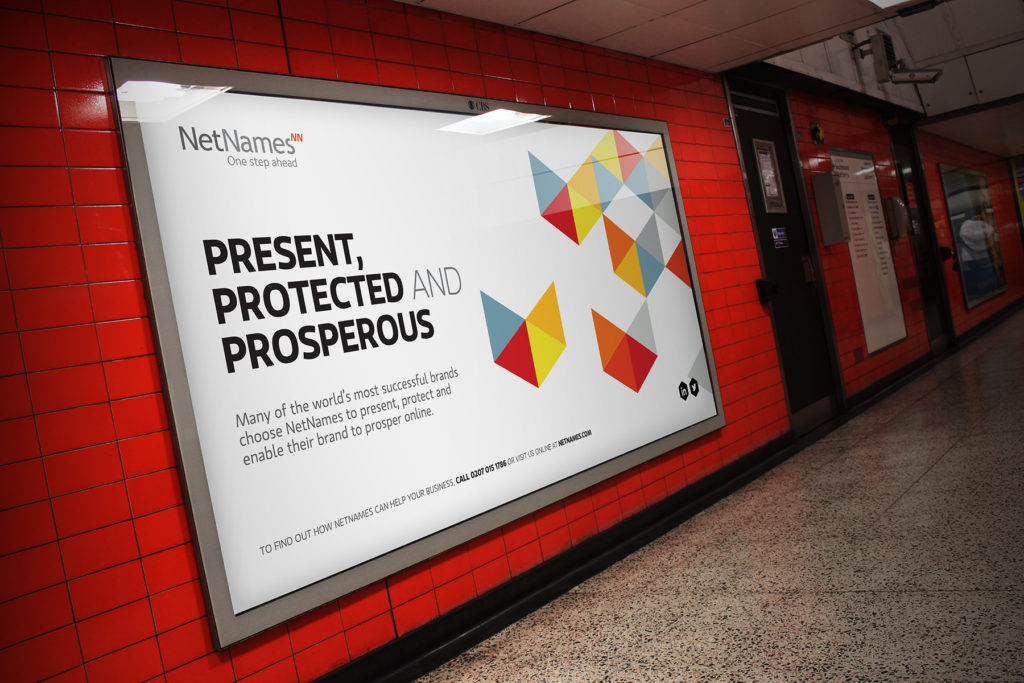
We looked at various systems which would enable clout yet bring consistency. We created a flexible hexagonal grid structure which constrained the digital branding to particular angles. This was then extended to graphical devices, forms and functional icons to ensure a design language which appeared linked and cohesive.
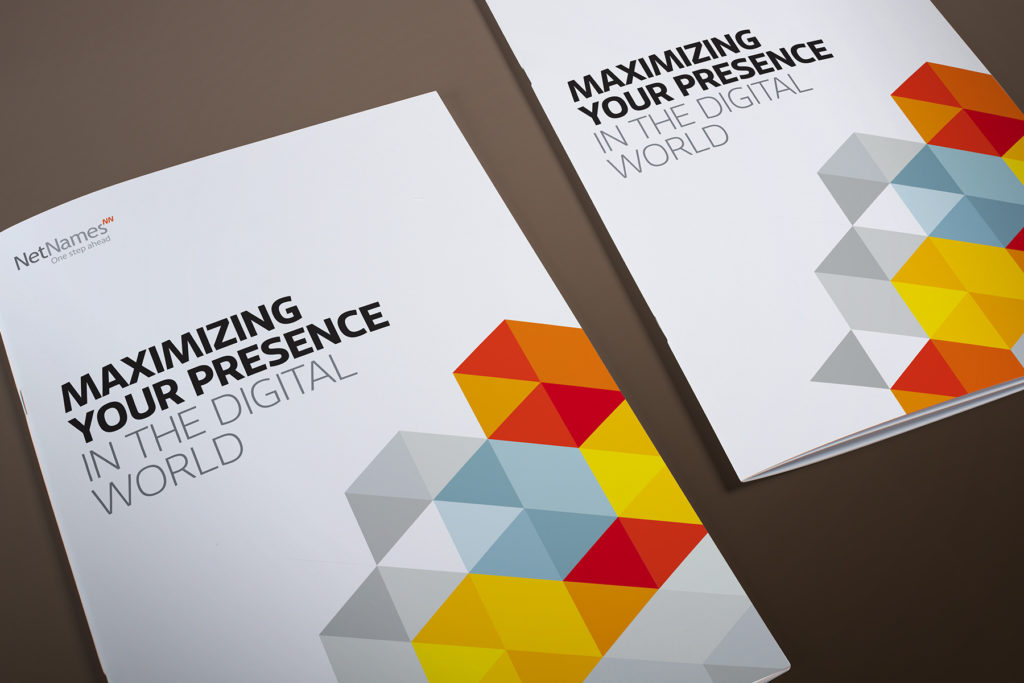
The colour palette was extended yet retained along the warm spectrum which allowed for a connected and harmonious colour system. This was supported in turn by a consistant typographic theme. The branding and visual identity has been wrapped up in an extensive set of brand guidelines which enables teams to commission design accurately and consistently.
Have a look at the full Netnames case study for more information on the project. Did you know that we also specialise in branding, visual identity and digital branding for the technology sector?