Case Studies
Brand evolution for the Royal Academy of Engineering
 Firedog has recently completed a full brand refresh project for The Royal Academy of Engineering (RAeng), Britain’s national academy for engineering and technology.
Celebrating its 35th anniversary as a progressive body, the Academy was looking to evolve their visual brand identity. The main aim was to reflect on the academy’s heritage and achievements, as well as embrace its future plans and ambitions through the new identity.
The aim of this project was to update and refresh the logo design and visual identity to ensure that it is in-line with the academy’s evolving strategy and vision – ‘making engineering the heart of society.’ The brand identity needed to convey an impactful and coherent message, whilst still being adaptable enough to resonate with a diverse audience, whose members engage with the academy for different reasons.
Have a look at the full case study.

We conducted an exciting research phase, whereby fellows of the Academy applied minds in an exercise to define the core DNA of the brand. We explored the Academy’s role in society and it became increasingly apparent that the “Heart of Society” positioning was very authentic and appropriate. The research also informed the creative process, exposing the current identity as rigid, restricting and not very imaginative.


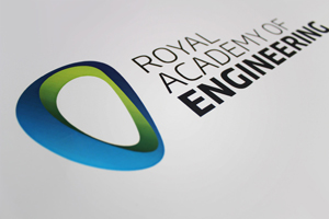
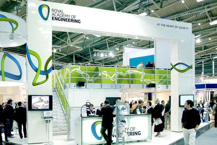
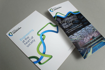
We refreshed the RAeng symbol, literally turning it on its head. We liked the idea that it was conceived around a flint axe, yet its orientation made it look more like a gas flame. We found the downward facing position more aggressive and dynamic, and closer to how a hand axe would be held. We combined this with strong typography which portrayed a more dominant entity. We followed through with a thread based visual identity device, which worked with the icon. All the creative work is wrapped up in a substantial guideline kit which allows in-house teams to apply the look and feel across the Academy’s full marketing remit.
The identity was launched in July and has gained approval from the vast majority of fellows and has already created a far more visible and powerful brand.


