Design
Web 2.0 logotypes. Childsplay?
 Firedog has recently been commissioned by a very dynamic web 2.0 outfit who are poised to send tremors through the online landscape within but a few months. A large deal of the initial branding work centred around research of the web 2.0 landscape and branding online.
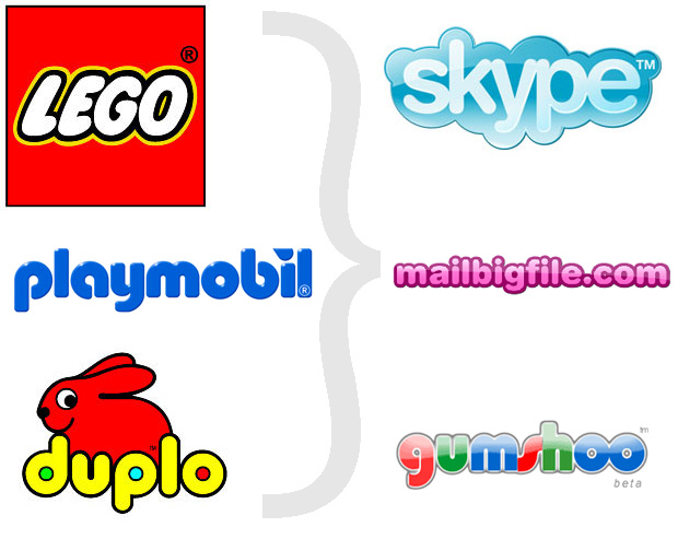
I’m afraid to say that I have come to a shocking realisation. The vast majority of web 2.0 logotypes out there feel exactly like the kids product logos we all grew up with. Ok, bar a few colour hue and saturation changes and some very nifty gradient work. Have a look at the image below and gasp, chortle and snigger as you too, come to this heady realisation.

Now, a large deal of brand strategy is geared towards user behaviour, trends and ultimately human psychology. This left me thinking; As a collective industry – What exactly informs web 2.0 companies to render their brands according to this aesthetic?
As sure as dark blue is the chromatic mistress to financial services branding, the online space follows some very interesting set rules which happen to funnily enough overlap with kid’s product branding. Type must be rounded, the colours have to be retina piercingly bright, there needs to be at least 2 different outline casings around the typography and enough soft cloud devices to lull even Tinkerbell into a sense of blissful brand security.
Look, I’m not denying firedog’s tendency to flirt a little with special brand fx and I’m not denying for a minute that the brand we will ultimately launch will be somewhat, ur, “nice and friendly”.
What really fascinates me is what I mentioned above. The shrink’s interpretation; Why do web 2.0 brands look like kids brands? Could it be that they know their companies are non-risk orientated – Not dealing in peoples lives, pensions or life issues? Or is it because most web 2.0 brands are run by very young risky fun individuals. Or is it because actually the web is really, to those of us that truly never grew up, just our 21 century plaything – our virtual playdoh?
I challenge you to add some logic and silence my rhetoric…


