Design
The 2012 Olympics in review – Inspiring a generation
 So that’s it – after 7 years in the making the London 2012 Olympic experience has drawn to a close. During the 6 weeks it was in our city, we collectively witnessed British Athletic’s biggest Olympic medal haul since the 1908 – ironically also held in London – and the triumphs of Athletics ‘A’ listers such as Usain Bolt and Michael Phelps.
Now the dust has settled and the lights have been turned off for the last time, was the games of the XXX Olympiad a success from a design and branding perspective? London has long been seen as one of the world’s creative hubs – did it live up to the hype?
The Logo
The logo itself needs no introduction – some would argue this is a good thing. Love it or loath it, the logo certainly sparked debate when it was launched back in 2007.
The official London 2012 website describes the logo as such:
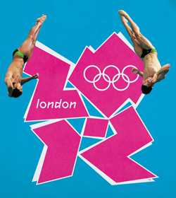
The logo of furious debate
“At the heart of the London 2012 brand is a bold Emblem. The Olympic Emblem is based on the number 2012 — the year of the Games — and includes the Olympic Rings, one of the world’s most recognised brands, and the word ‘London’ — the world’s most diverse city. For the first time for a Host City, the Emblems for the Olympic Games and Paralympic Games are based on the same core shape, reflecting London’s commitment to hosting a truly integrated Paralympic Games.”
Shortly after the emblem was unveiled, a Change the London 2012 Logo petition was set up on GoPetition.com. The creator of the petition believed the logo was an embarrassment, and that it portrayed the host nation “in the worst possible way.” Two days and nearly 50,000 signatures later, the petition was closed, as it became clear that the logo would not be changed.
Many in the design industry and beyond have declared it “a disgrace” and simply “unlovable.”
Amongst designers, the new logo was openly criticised for being simply ugly, the design assimilating broken shards or an impossible puzzle. It bucked pretty much every design trend and only on a second look could you decipher the 2012 date with an ambiguous dot in the middle. Some of the stronger views claim to read “zion”; others, “nazi”; and many more perceive Lisa Simpson performing a sex act, no less. The acid colours were questioned and frowned upon – the vibrant fuscia (or turquoise) backed by a bright yellow. In summary – many in the design industry and beyond have declared it “a disgrace” and simply “unlovable.”
In its defence, Ije Nwokorie, Managing Director of Wolff Olins in London, said :
“When you do something like this you expect to get a very mixed response. … The critical reviews tend to point out the rules we’ve broken, and in that sense they tend to be correct; the only disagreement is whether those rules needed to be broken. Take a look at the attacks: ‘It’s too dissonant.’ Absolutely, the dissonance was intentional. ‘It doesn’t reflect any of London’s famous landmarks.’ Absolutely, the world knows about those, we don’t need to tell them. ‘It’s too urban, it’s too young.’ Absolutely. It’s really interesting that even though the tone might be off, they shine quite an acute light on exactly the points we were trying to make.”
I certainly agree that Wolff Olins and the London Olympic committee wanted to buck the trend of Olympic logos going back over past decades – London is a creative hub and the time was right to rewrite the rule book, so to speak. They certainly created an edgy, youthful, unforgettable logo that boldly reflects the energy inherent to the Olympics. Unconventionally bold, deliberately spirited and unexpectedly awkward, it reflects London’s qualities of a modern, vibrant, edgy city.
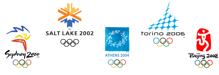
Olympic logos of days gone by
Past Olympic logos have been safe, conservative marks that fade to obscurity before they are even printed. At least London 2012 makes a statement.
The emblem illustrates that the games are more than London, more than sport – containing neither sporting images nor pictures of London landmarks – the games are for everyone, regardless of age, culture or language. In ditching design conventions and stale nationalistic imagery, London 2012 stands as bold statement of British design. Past Olympic logos have been safe, conservative marks that fade to obscurity before they are even printed. At least London 2012 makes a statement.
In making a statement, the logo had to be different and represent the brand promise – to “Inspire a generation”. This has been interpreted in the logo itself as a blocky ‘graffiti style’ lettering that would fit more comfortably with a 1980’s kids tv show rather than at the Olympics. The style looks quite basic and lacks the authenticity associated with an event of this calibre. On a practical level though, there are several design issues that have simply been overlooked with the logo – not least legibility. Cramming the word London – with a lowercase ‘l’, within one shape and the Olympic rings within another compromises legibility at smaller sizes. This is particularly noticeable as an endorsement on third party applications. The legibility is further compromised when varied imagery and textures were placed within the logo itself after it was released to global sponsors, all of whom wanted to make the logo fit with their own.
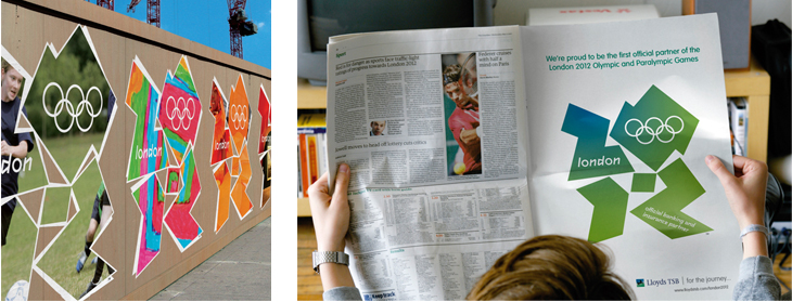
The logo in brand application
How often has someone proposed an idea to you that seemed crazy at first, only for it to begin to make more sense as time passes?
However, how often has someone proposed an idea to you that seemed crazy at first, only for it to begin to make more sense as time passes? That’s why we say “sleep on it”, or “mull it over” – because the passing of time can make things that initially seemed difficult, complicated or shocking start to unfold and become clearer. As ideas work their way into our consciousness, we start to look beyond our initial response and see them in more depth.
It was always going to be difficult to introduce a logo 5 years prior to the event and expect immediate acceptance. That said, it is interesting in hindsight to review the identity now as a whole – how it was rolled out across multi-media applications and through all of its channels – and review the outcome as a successful brand identity (or not).

The logo has various applications such as above
The visual identity
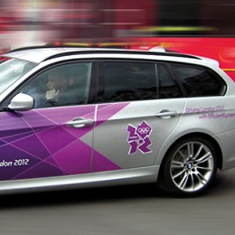
Futurebrand were passed the baton, as it were, to develop ‘the look’ of London 2012 and create an identity system that worked across every touch point. From venues, signage, street dressing and ticket design through to medal ribbons, and the cars that would ferry athletes around.
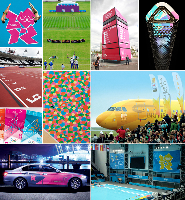
The visual look and feel in action
Interestingly, here the whole identity system turned back to the logo itself to create a distinctive and visually arresting system. The symbol that was shunned by many became the basis for the brand execution.
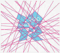
The basis and structure of the visual identity system
Matt Buckhurst, Creative Director, Futurebrand London:
“The core idea was to use the lines and shards that the logo emanates, creating a ‘burst of energy’. Whether through the entire field of play with the seating becoming a huge graphic, or simply surrounding the Olympic rings with the burst, printed on a coral on the field of play. It all goes back to the idea of a festival of human endeavour, with athletes pushing beyond their personal best.”
In application the grid is used in a flexible and dynamic way, creating shards of patterns and textures that radiate from a central focal point. The benefit of this simple yet very effective system is that the graphic device can be adapted across lots of different spaces and places yet remain clearly recognisable and consistent.
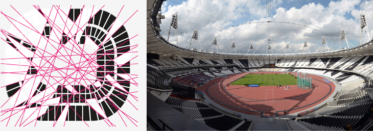
The look and feel finds it's way into the architectural and environmental features
This graphic pattern has become synonymous with the games and effectively captures the spirit and energy of the Olympics and the city. The core idea was evolved to create separate but related identities for each of main sub-brands that were a vital part of the London 2012 experience such as games makers, the torch relay and the London 2012 festival.
In application the pattern was used not only as a flat graphic texture – but also as the basis of the look and feel for the direction system, entrance gateways and stadium seating blocks across the Olympic park.
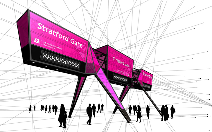
The signage application
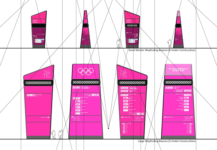
Applied to totems
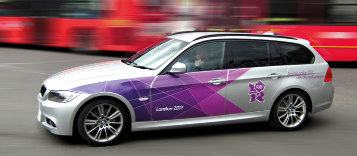
The ubiquitous Mercedes
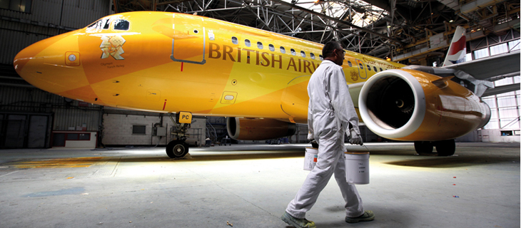
Livery applied to British Airways 2012 Firefly – Which carried the Olympic flame across to the UK
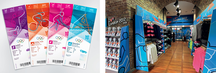
In retail application including ticket stubbs
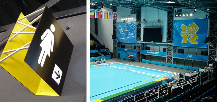
Environmental application of the identity
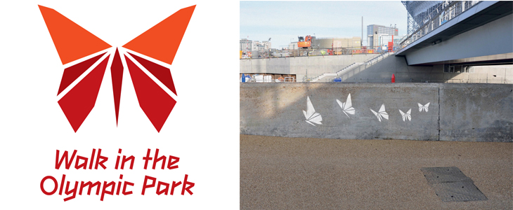
Some more street art style application
Accompanying the graphic pattern is the distinctive Olympic typeface – designed to sit comfortably with angles and shapes this is a distinctive and characterful headline type. Its simplicity and modernity adds real value to the brand and ensures all applications remain uniquely London 2012. Unfortunately it does fall down when used for larger areas of type and messaging because the type can become hard to read. However, for the getting the key message it was designed for across in an instant quick hit, it evokes the right spirit.
The overall visual effect when seen in its entirety creates a distinctive and successful visual identity that really came alive in application. The logo which received so much criticism when originally unveiled didn’t feature very strongly in the brand visual look and feel. It ended up being the brand texture and typeface that became the most synonymous elements of the identity alongside the Olympic rings.
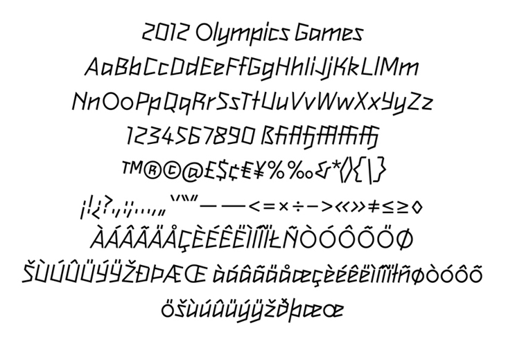
The typography
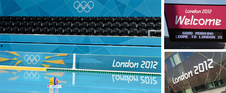
Graphical wallpaper in situ
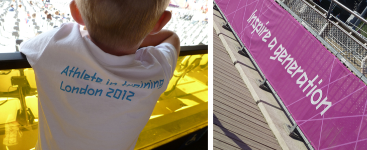
Applied to Ts and practically any surface available
Personification of the brand
Gamesmakers – tasked with living the all important brand values and ensuring the brand experience was simply unforgettable.
A key element of the brand – so often forgotten – were the people behind the brand – those tasked with living the all important brand values and ensuring the brand experience was simply unforgettable. This task was handed to the ‘Games makers’ – who from my personal experience more than lived up to their grand titles. From the moment you entered the Olympic park you were greeted with smiling faces, a ‘can do’ attitude and a real sense of occasion – that you were going to have a great day – that you were going to be inspired.
Suddenly the huge queues outside attractions didn’t seem so bad
They personified the spirit of the Olympics, with the energy, the exuberance and the real sense of the fun they injected. They gave the whole Olympic park a real festival feeling – and the collective euphoria which embedded itself into the thousands of people that visited daily. Suddenly the huge queues outside attractions didn’t seem so bad – spirits were high as a collection of street artists rocked up to perform and games makers entertained the kids.
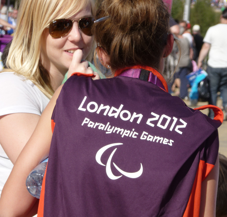
The Gamesmakers took London to a whole new level
In summary
London 2012 was real proof that a brand is so much more than the logo or symbol attached to it – it is much more about how the brand is executed, how it lives in context and how it is bought alive by those associated with it.
London 2012 was real proof that a brand is so much more than the logo or symbol attached to it – it is much more about how the brand is executed, how it lives in context and how it is bought alive by those associated with it. It is interesting to see how much opinions towards the logo have changed now that the brand has been seen as a whole.
While Cliff originally panned the logo when it launched, a lot of supporting material developed by numerous creative partners has created a number of parts which form a greater whole. It’s telling sometimes that given context, the public can accept far more radical thinking than we give them credit for.
Now they have had chance to ‘live with it’, and ‘mull it over’, people have come to accept the logo. The fact is that it has engaged successfully with the younger urban market it was supposed to appeal to. Love it or loath it, it’s highly distinctive and, when seen in the context of otherwise quite serious communication such as an endorsement on corporate sponsors’ advertising, it does lend an air of youth, excitement and optimism. Its legacy will prove that, and now we look to Rio in four years time to see the knock on effects. London did indeed rewrite the rules and proved that we are at the forefront of creativity and innovation.
Most importantly – it lived up to the brand promise – to “Inspire a generation”. A job well done to all involved – you made us proud – good luck Rio!


