The dog speaks
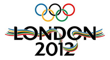
The shockingly new London 2012 logo. Oh dear.
![]() Not to jump on the band wagon and pan a fellow design company, but Wolf Olins have really got it wrong this time around. (Or at least the third time around for the fine purveyors of the BA tailfin fiasco and the off-brand Abbey dibacle). For a brand logo to work it has to follow a few simple rules, before you move on to the subject of strategy. And when it comes to this execution it really does feel like the £300 000 budget was split £299 999 strategy and £1 design.
Not to jump on the band wagon and pan a fellow design company, but Wolf Olins have really got it wrong this time around. (Or at least the third time around for the fine purveyors of the BA tailfin fiasco and the off-brand Abbey dibacle). For a brand logo to work it has to follow a few simple rules, before you move on to the subject of strategy. And when it comes to this execution it really does feel like the £300 000 budget was split £299 999 strategy and £1 design.
In my sincerest humble opinion, a few rules may apply to a branding project of this size and stature:
Brand design, rule number one
Make sure that if you are designing for a large audience, you engage that audience. This can be achieved in a couple of ways but not for example by suddenly announcing: “Oh by the way, here is our new logo. And we’ll be damned if we’ll change it for you, you snivelling non-(puke)design-savvy cretinous public.” It seems like within 24 hours of launching the logo, the misinformed powers that be, have completely alienated the entire city. Well done, that certainly is a skill worth paying half a mil for.
Brand design, rule number two
Make it pleasing to look at. Sounds obvious doesn’t it? But hear this, people react to their subconsious way before they stop to give a piece of design any thought whatsover. If your mark is not aesthetically pleasing, what is the point? You certainly are not appealing to peoples emotions, so how can you expect to win hearts over?
A couple of rules off the top of my head for you there. I could carry on, but I think the creators of the new london 2012 logo have plenty of critical write-ups to choose from. Happy reading fellas…
 (Image shown to the right – the original successful branding from smaller, and perhaps not so strategic, Juno Design)


