Grey matters
The weekly roundup: minimal design, Leif Podhajsky and who to follow on Behance
 Unlike Charlie, our studio debates this week didn’t involve likening Putin to Hitler. We discussed the destructive way in which we’re programmed to interpret “innovation.” On a lighter note, take a look at Leif Podhajsky’s impressive album artwork and read how we’re celebrating our 12th birthday.
Eye-catchers
 We’ve often admired the album artwork for Foals, Bonobo and Tame Impala, but only recently twigged that one man was behind all three. Australian graphic designer, Leif Podhajsky, has an impressive artist list to his name; his latest artwork for Kelis has attracted even more critical attention. Podhajsky says the album is inspired by “soul music and visuals of the past…with modern overtones.” Why don’t you take a look at his work for yourself?
We’ve often admired the album artwork for Foals, Bonobo and Tame Impala
With almost 30 million portfolio views in the past 30 days, Behance is a source of creative inspiration from top graphic designers and agencies. But who should you follow? This useful article collates the best graphic design portfolios on the network. Swiss art director Juri Zaech’s work is a favourite of ours; we particularly like his focus on typography.
Need a high res digital image but strapped for cash? The Metropolitan Museum of Art has just released a vast archive of 400,000 images online that you can download and use for non-commercial purposes. Just scroll down this article to see the vast range of images available.
Need a high res digital image but strapped for cash? 
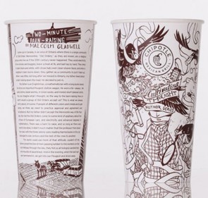
We always appreciate well thought out packaging, and Chipotle Mexican Grill’s latest marketing strategy deserves appreciation. In the coming weeks, Chipotle’s cups and bags will be covered in illustrations and feature a brief essay from a famous author, journalist, or comedian. For the series’ curator, Jonathan Foer, “the idea of creating a small pocket of thoughtfulness right in the middle of a busy day was inspiring.”
Studio Buzz
This FIFA hypothetical rebrand got us talking about the resurgence of minimalism in design. Gone are the days of glossy playfulness; everything is slick, crisp…And a bit a bit dull to some. Ale really liked this rebrand idea, while Cliff thinks that it fails to capture the playful element of football. Have we oversaturated minimal? If so, what will the next design wave bring?
It was our 12th birthday on Tuesday! To mark the day, we celebrated with chocolate brownies from the best bakery around, Albion. The bigger – albeit less tasty – treat is that we’re off to Amsterdam in July for a team weekend away. We’re already putting an itinerary together to make the most of the city. We’ve been discussing other ways to mark the birthday, so watch this space.
 Are you young and driven? Have you been conditioned to believe that innovation results from grand, sweeping notions and a huge amount of experience under your belt? In this thought-provoking LinkedIn article, Elliot S. Weissbluth argues otherwise. Innovation results from the “tinkerers, not thinkers”, and experience can actually result in getting constrained by the “old way” of doing things. What’s your stance on the subject?
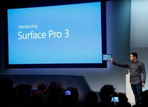
Surface Pro 3 has launched this week. Despite his best efforts, Cliff is still having a hard time convincing creative staff on the merits of a non-Apple existence. In his words, “it’s like trying to juggle jelly in a hurricane…you’ve all been mind controlled!” There are a few of us that still use PC, but the (predominantly) Mac-lovers in the office are united in their commitment to Apple. Cliff is still trying to convince us on the merits of a non-Apple existence
Creative projects
It’s been an exciting and busy week. Our second round poster concepts for a big campaign in the renewable energy sector went down well, and we’ve been developing the visual look and feel for an internet brand security firm. Other than that, we’ve been doing some web tweaks on client websites.


