Grey matters
The weekly roundup: the weirdest things people Google, Matisse and Pick Me Up
 Hope you enjoyed your Bank Holiday Monday? Some of us spent the day at a graphic arts festival, while others opted for the Matisse exhibition at the Tate Modern – definitely worth a visit! Back in the studio, hot topics this week have been typefaces in capital cities and placing bets on Stinky Socks. Read on.
Eye-catchers
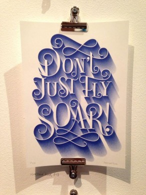 Designer Bryn spent his Bank Holiday Monday at Pick Me Up, the UK’s contemporary graphic arts festival. In its fifth year, the festival showcases graphic art in all its forms. It’s split into three sections – artists who were selected by a panel, graphic art galleries who curate a customised studio space, and studios selling prints. For Bryn, it was the typography from Brighton-based studio Unlimited Shop that really stood out. Also to note was Beach London, a creative agency that has collaborated with design studio Ustwo.
Pick Me Up showcases graphic art in all its forms
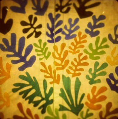
Hannah took a trip to the Tate Modern for the eagerly-anticipated Matisse exhibition, “The Cut Outs.” It’s hard to believe that the artist achieved this work using just paper, pins and scissors. The sheer scale of the pieces makes this exhibition worth visiting – some works cover entire walls. Prints lose the layering effect created by the pins, so the exhibition is definitely worth a visit.
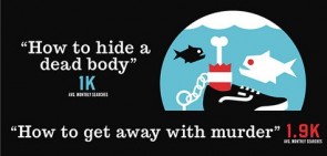
Ever wondered what the weirdest things people Google might be? Ever wondered what the weirdest things people Google might be? 4.4k people per month Google “How do I Google something?”, 5.4k people ask Google “how to have an affair”, and an alarming 40.5k type in “why did I get married?” This infographic from Australian SEO company Search Factory reveals all.
Studio buzz
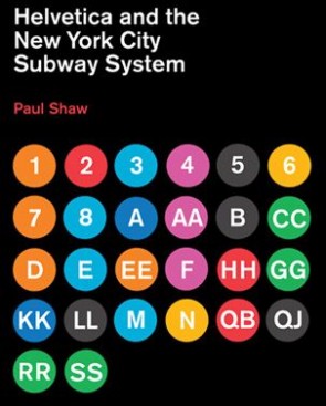
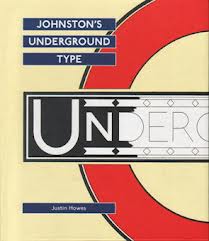 A big studio discussion this week revolved around typefaces in capital cities – especially regarding the difference in signage between London and New York. Transport for London has been using the Johnston typeface for almost a hundred years now, which stemmed from a need for a typeface that would “belong unmistakeably to the twentieth century.” New York uses Helvetica, which is arguably the most famous typeface in the world. Which do you find the most legible? This led to a debate over the primary aim of typefaces: legibility or aesthetic quality?
A couple of us went to the Queen of Hoxton for a private BBQ and drinks on Wednesday. With an impressive rooftop overlooking the London skyline, the venue didn’t disappoint. The Queen of Hoxton is showing films every night until the end of May – here’s the link for more information. The Queen of Hoxton is showing films every night until the end of May
As we’ve been working on horse-related projects recently, the designers are placing bets on the 5.35 Ascot race today. With bookies’ favourite Stinky Socks, Sam’s in with a strong chance. Matt’s hoping that Arabian Queen will produce the goods, and Jag’s pinning his hopes on the romantically-named Golden Zephyr.
Creative projects
 It’s been a busy yet productive week, with a couple of new business pitches and a lot of client meetings. We also sent out our bi-monthly newsletter – why don’t you take a look for more information on what we’ve been up to recently?
