Impressive
This Shit Is Bananas B-A-N-A-N-A-S

The lyrical wordsmith Gwen Stefani rarely sums up my emotions accurately, but you know what? I think I finally understand what she was chatting about. MailChimp.
I pretty much adore the entire brand of Mailchimp, its UI, tone of voice, ease of use, support, API, documentation and (not to be underestimated) its humour. The environment and functionality is an absolute delight to work with. It seems that it’s not just me who thinks this, .net magazine voted MailChimp as the redesign of the year (and rightly so).

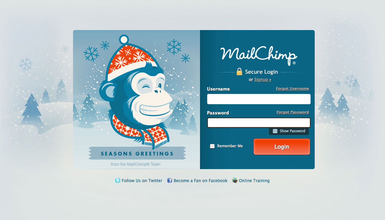
MailChimp does Christmas

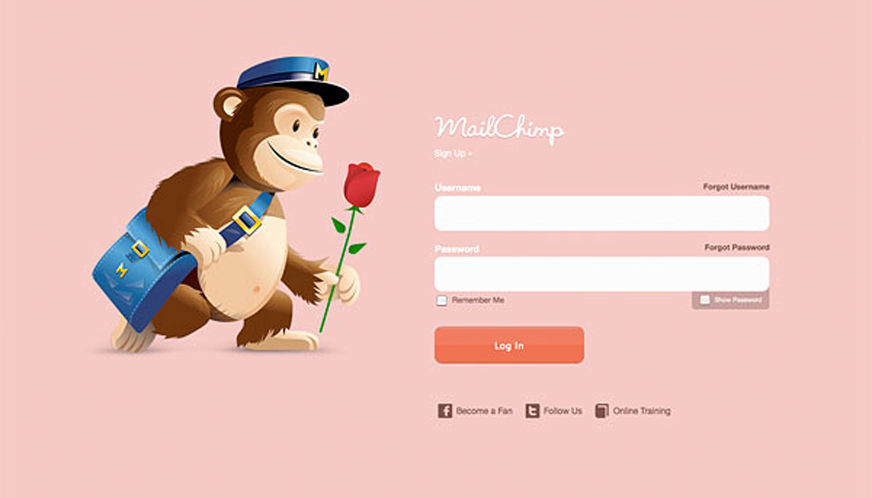
The romantic side of the brand

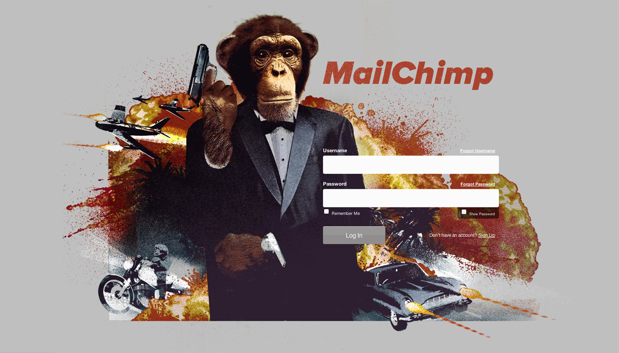
The names Chimp, MailChimp.
MailChimp helps you design email newsletters, share them on social networks, integrate with services you already use, and track your results. It’s like your own personal publishing platform.
Here we can see how MailChimp have the ability to change the user experience over time, something that makes the audience feel special and cared for, the brand is consistent, but once in a while MailChimp give their audience a little Easter egg, and this is something that I personally, am very grateful for.
The James Bond log in screen (if I remember correctly) didn’t even have a rationale, I certainly don’t remember a film release around the time of its use, but it made me smile. I guess that’s the whole point, a positive brand association. Its these brand nuances that make people want to blog, share and recommend services, so as you can see, its been very successful.
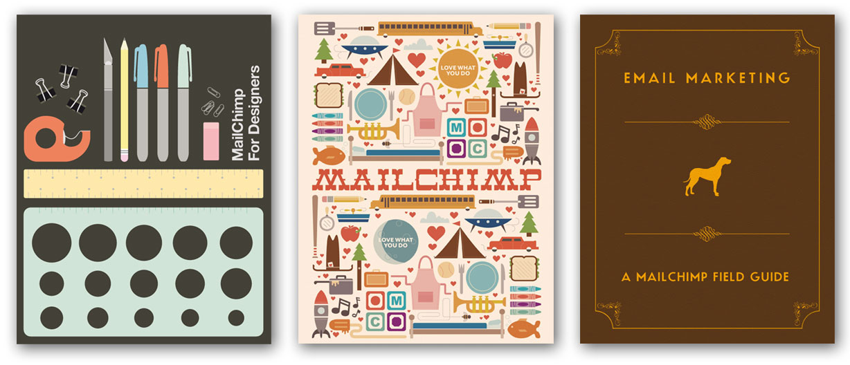
The MailChimp approach doesn’t stop with the login pages, here you can see a selection of support documents, ranging from coloring books (really) to how to effectively compose email campaigns including tips to bypass spam filters successfully.

Bespoke artwork commissioned for each document, very impressive graft.

Humourous little links to YouTube videos
Now I mentioned MailChimp has a sense of humour, this is conveyed not only in some of its brand applications, but also integrated into the site, whether it be sending the user on a little comedy journey to YouTube where some chimp or another is getting up to some hi-jinx.
The humour is even deeper ingrained in other areas, MailChimp offers the functionality to translate your newsletters and mailshots, you can translate into Spanish, French and being MailChimp – “Chimpish”, which consists of Eeeeps! and other noises.
The branding we see today was by Jon Hicks, who also created the FireFox logo, there is a great article about the brand evolution on the MailChimp site.
So next time you are looking for an email/newsletter campain or even someone to mainintain your mailing list, give MailChimp an Eeep! -That’s Chimpish for “look”.


